
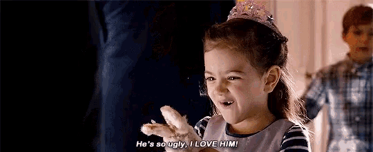
So ugly, I love it.
Embracing imperfection in illustration
There’s a growing trend in design: rejecting perfectionism and embracing uniqueness. It’s showing up in typography (a personal obsession I’ll save for another post), but today, let’s talk illustrations.
I love illustrations that look hand-drawn, whether they’re actually sketched on paper or digitally crafted to feel organic. Give me uneven lines, brush strokes that wobble, imperfect shapes. I don’t know if this is the best sales pitch, but: I love to draw “ugly”. Or maybe a more flattering word would be quirky, unique, or just pieces that have personality. There’s something approachable about it. It’s human. It’s relatable.
Picasso: The master of the imperfect
Some of my favorite paintings are by Picasso. (Quick disclaimer: I love the art, not necessarily the artist. I always feel a bit of cognitive dissonance there.) Somehow, I deeply admire the laissez-faire attitude in works like The Pigeons series or the dogs in his Las Meninas variations. I mean, look at them.
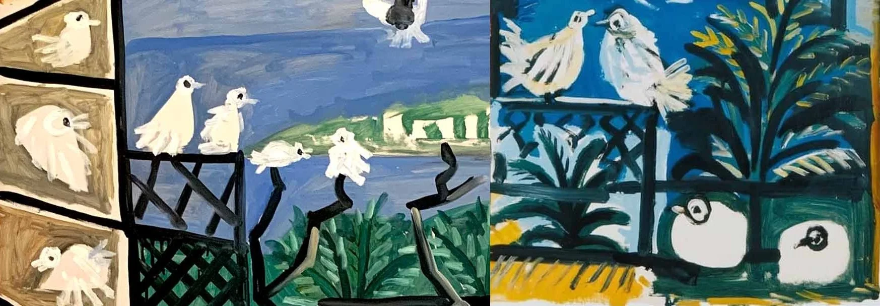
Parts of the series The Pigeons by Picasso. Photos: Picasso Museum
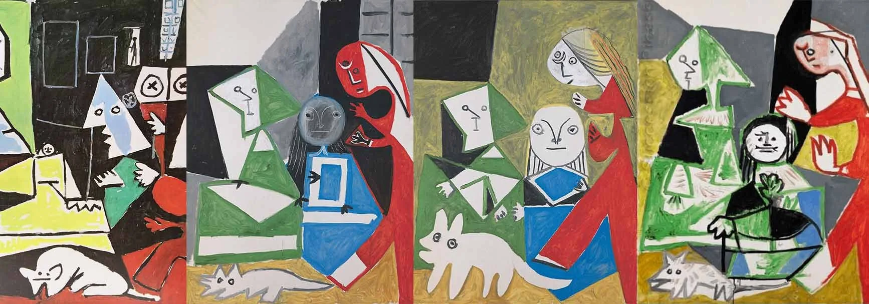
Parts of the series Las Meninas by Picasso. Photos: Picasso Museum
Sidenote: There’s a recurring internet mistake I’d like to correct. Lots of memes and posts label these animals as cats. But since these appear in Picasso’s reinterpretation of Las Meninas, originally by Velázquez, I’d argue they are dogs, just like the dog in the original painting. Now it’s fixed.
Anyway, back on track.
There’s a famous quote by Picasso (at least according to every Pinterest board):
"Learn the rules like a pro, so you can break them like an artist." And I totally agree.
Rejecting my perfectionism with a “broken” art style
Maybe my love for this so-called “ugly” style is my way of rejecting my inner perfectionist. In other design tasks like corporate layouts or Bauhaus-style minimalism, for example, I can spend way too long adjusting pixels. But when I’m drawing by hand (or digitally with a hand-drawn feel), it doesn’t have to be pixel perfect. There’s no “wrong” answer.
That said, I can still obsess over a wobbly line, just in a different way. It has to wobble right.
Like Picasso’s quote suggests, I had to learn the rules before breaking them. I studied correct human proportions, pencil shading, color theory. Even in digital work, I got tips like: don’t cross vector paths. Okayyy… boring. But I learned it all, so that I could later intentionally ignore it. However, I actually find it more difficult to nail the imperfect style, to make it look “correct” in a way that still has personality.
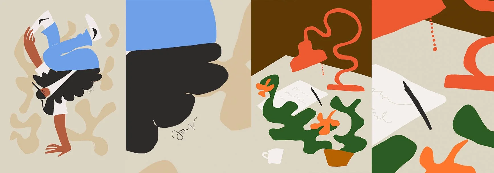
Parts of my illustrations. Embracing the organic shapes and wobbly lines, even crossing themselves.
As a contrasting example, let’s take a very different kind of illustrator: Malika Favre, whose work I admire equally, even though it’s style-wise very different from mine.
I’ve seen her speak at design events, and once she said she enjoys organizing files alphabetically, doing taxes, keeping things in order. I’d love to be that person. But it made sense: her illustration style is incredibly organized, geometric, pixel-perfect. Clean, controlled, structured. That doesn’t leave room for imperfection.
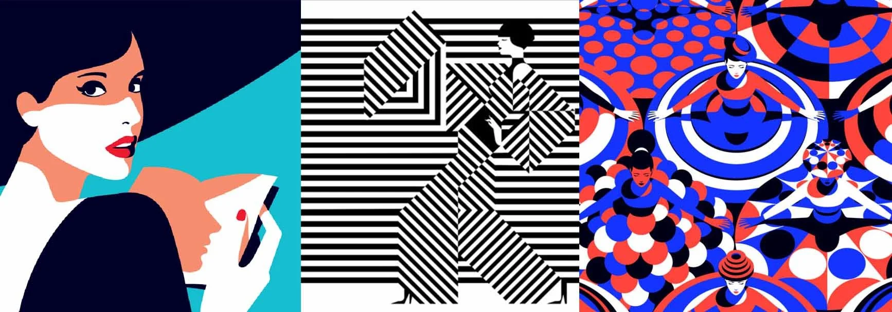
Illustrations by Malika Favre.
Why “ugly” works in branding, too
This style isn’t just a personal preference, it’s making its way into branding, too. And it’s working.
Brands are moving away from slick, overly polished visuals or the overused Corporate Memphis style. I’ve even seen more and more illustrator call-outs saying something like, “Looking for an illustrator. Open to different styles, but please, no Corporate Memphis.”
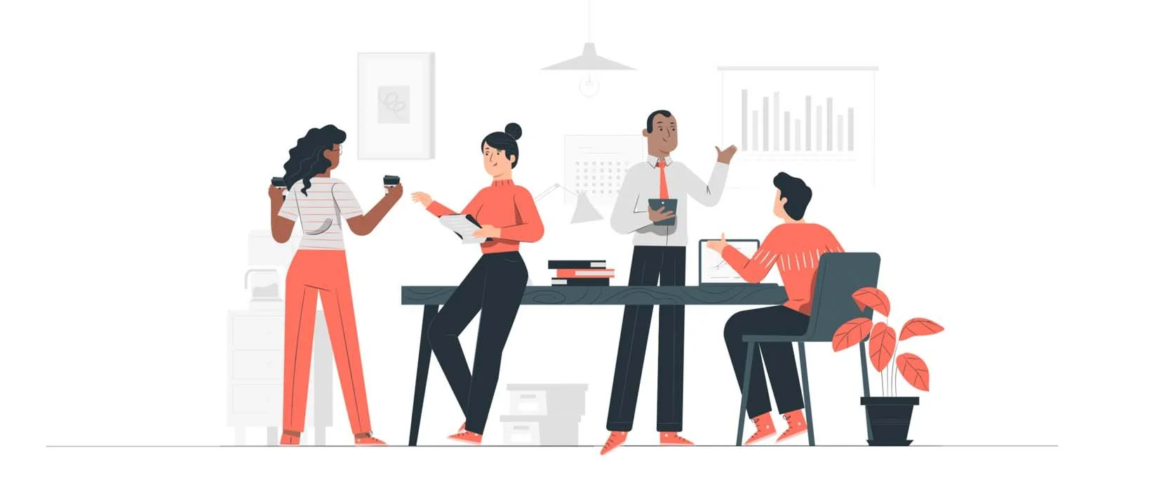
Corporate Memphis style, image: Storyset
The quirky, hand-drawn aesthetic signals something deeper: authenticity, approachability, creativity. It tells you, “We’re human, not a faceless corporation.” These illustrations don’t try to impress with precision. They connect with emotion. They say, we're not perfect, and that’s okay.
Here are some examples of smaller, boutique-style brands I’ve come across in my work and travels:
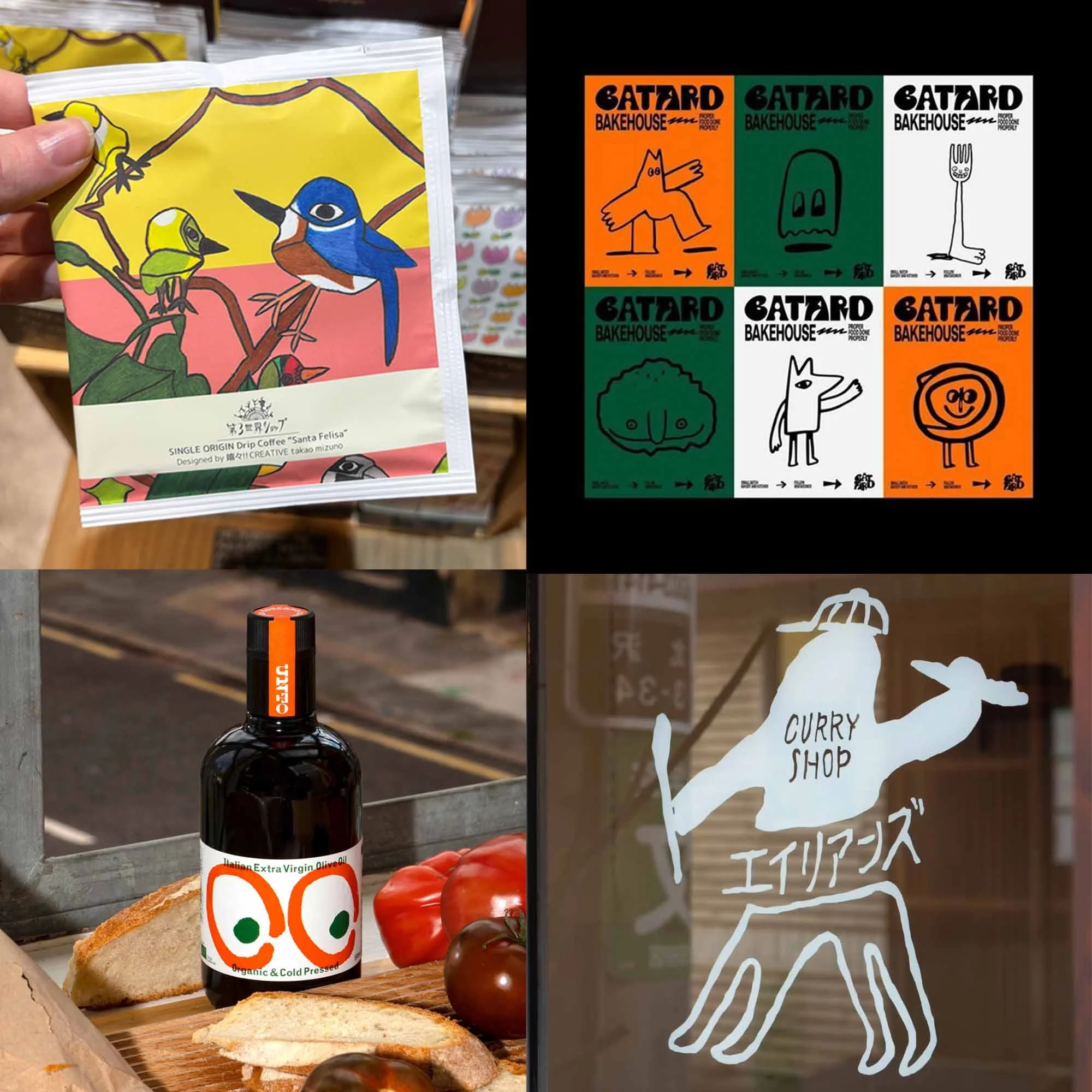
1. Tea bag design by Takao Mizuno (photo from travels), 2. Batard Bakehouse, 3. Unto Olive Oil by Studio Bergini, 4. Curry Shop in Tokyo Shimokitazawa (photo from travels)
However, it’s not only smaller boutique brands embracing this hand-drawn style. Larger corporations have also begun to realize that brand illustrations can take a more artistic, less conventional direction. Of course, this shift takes a certain amount of bravery, it’s a move away from the safe and expected.
Some great examples include Dropbox, which experimented with surreal, hand-drawn visuals to give its identity a distinct voice, and Mailchimp, which has long embraced playful, imperfect illustrations that feel personal and human.
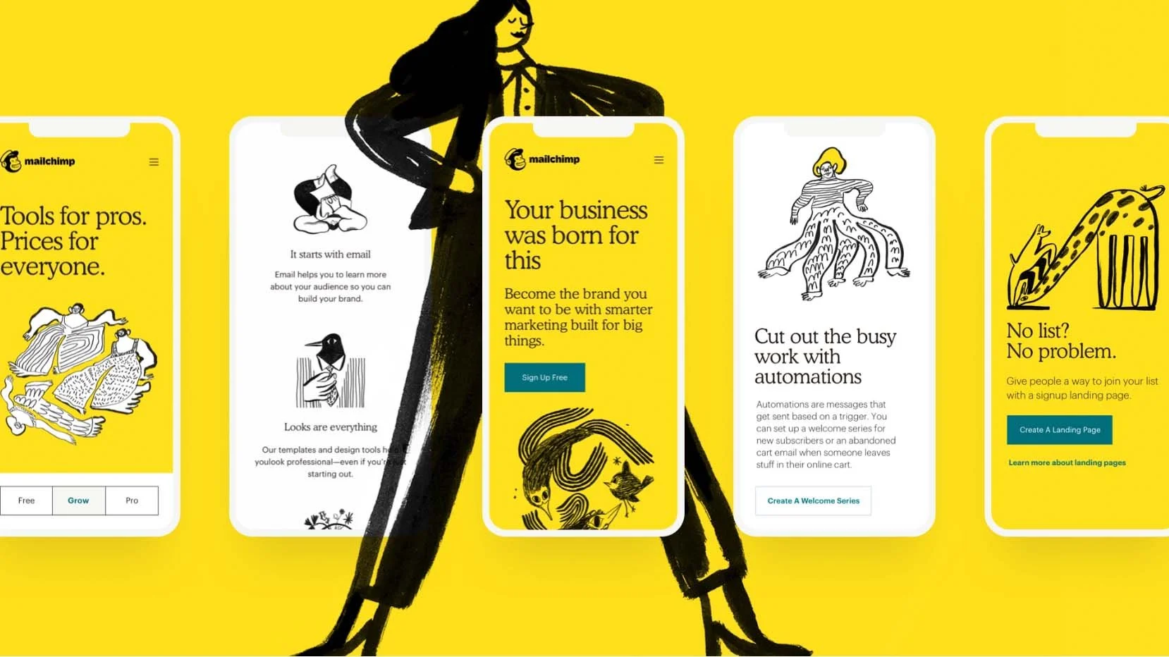
Image: Mailchimp
Final Thoughts
Ugly, quirky, imperfect, human like illustrations are here to stay. And I love that. Whether you call it a rebellion against perfectionism or just a stylistic choice, it brings soul into design.
So yeah, give me the weird shapes. The pencil-like textute. The wobbly lines. The crossed vector paths. So ugly, I love it.