The sacred logo: When to break the rules of branding
Deep in the world of branding, somewhere between typographic choices and color codes, sits the logo. It is the untouchable key element, the visual cornerstone of a brand's identity. Ask any design director and you’ll likely hear it recited like scripture. "Leave enough clear space around the logo." "Never change the color." "Do not rotate, stretch, or distort."
These are the typical rules of many guidelines. And yes, I’ve included these rules in many of the guidelines I’ve created for my clients as well.
And yet, we often see brands bend them. Heck, I have bend them myself. Sometimes even for the very same brand that I created these rules for. The logo appears in rainbow colors during Pride Month, out of brand color palette. It’s modified in creative campaigns. It gets playful, emotional, even poetic.
So the question is simple. When is it okay to break the rules of logo usage?
Why logo rules exist
The rules exist to ensure consistency. A logo is not a decorative element. It is a strategic tool. When used consistently, it builds recognition. Over time, that recognition leads to familiarity, and familiarity creates trust. In a crowded visual world, trust is currency.
A logo becomes iconic not by being beautiful, but by being repeated. Repeated in the same way, across every touchpoint. From billboards to business cards. From the website header to the corner of a smartphone screen. But of course, the rules are also there to ensure that the logo stays beautiful and stylish, as it was designed originally. One of my clients once said, “As much as we’d like to include everyone and give them creative freedom, we just have to keep some parts fixed. Otherwise we’ve noticed that there’s as many styles as people in the company.” And I get that, logo should be one place were this rule is applied.
That’s why brands are so protective of their logos. It’s not about ego. It’s about equity.
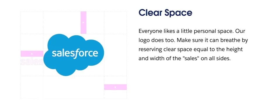
Here are typical examples from Spotify and Salesforce of a typical logo miseuse page and clear space rules of brand guidelines:
Source: Spotify Brand guideline
Source: Salesforce Brand Guidelines
When the logo becomes a voice
But at a certain point, a logo becomes more than a stamp of ownership. It becomes a kind of voice. It speaks for the brand. And like any voice, it can shift tone.
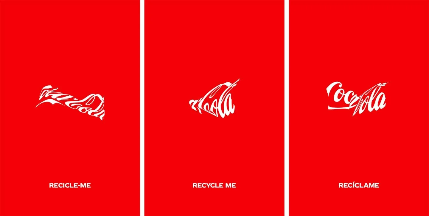
Some time ago Coca-Cola released a campaign where its iconic logo appeared warped, flattened by the physical shape of a crushed can. It broke every rule in the brand manual. But it also made perfect sense. Coca-Cola’s crushed logo campaign is a perfect example. The logo was visibly damaged. Bent. Deformed. Yet it remained unmistakably Coca-Cola. More than that, it communicated something. It carried an emotional tone. Vulnerability. Heartbreak. Humanity.
Coca-Cola Recycle me campaing by Ogilvy.
It worked because the visual distortion aligned with the message. The damage was symbolic, not random. The brand wasn't being careless. It was being intentional.
Google does this regularly with its Doodles. The logo becomes a stage for celebration. Sometimes it plays. Sometimes it educates. But it always stays recognizable. That’s the key.
So, who can bend the rules?
Not every brand can afford to break the rules. You have to earn that flexibility.
Strong brands can bend their logos because they have built recognition over time. They are familiar in the minds of their audience. If McDonald's flips its golden arches upside down, people get the point. If an unknown burger chain does the same, it may only cause confusion.
Before you break the rules, ask yourself if your brand is known well enough to survive the change. If not, stick to the book. You are still building the foundation.
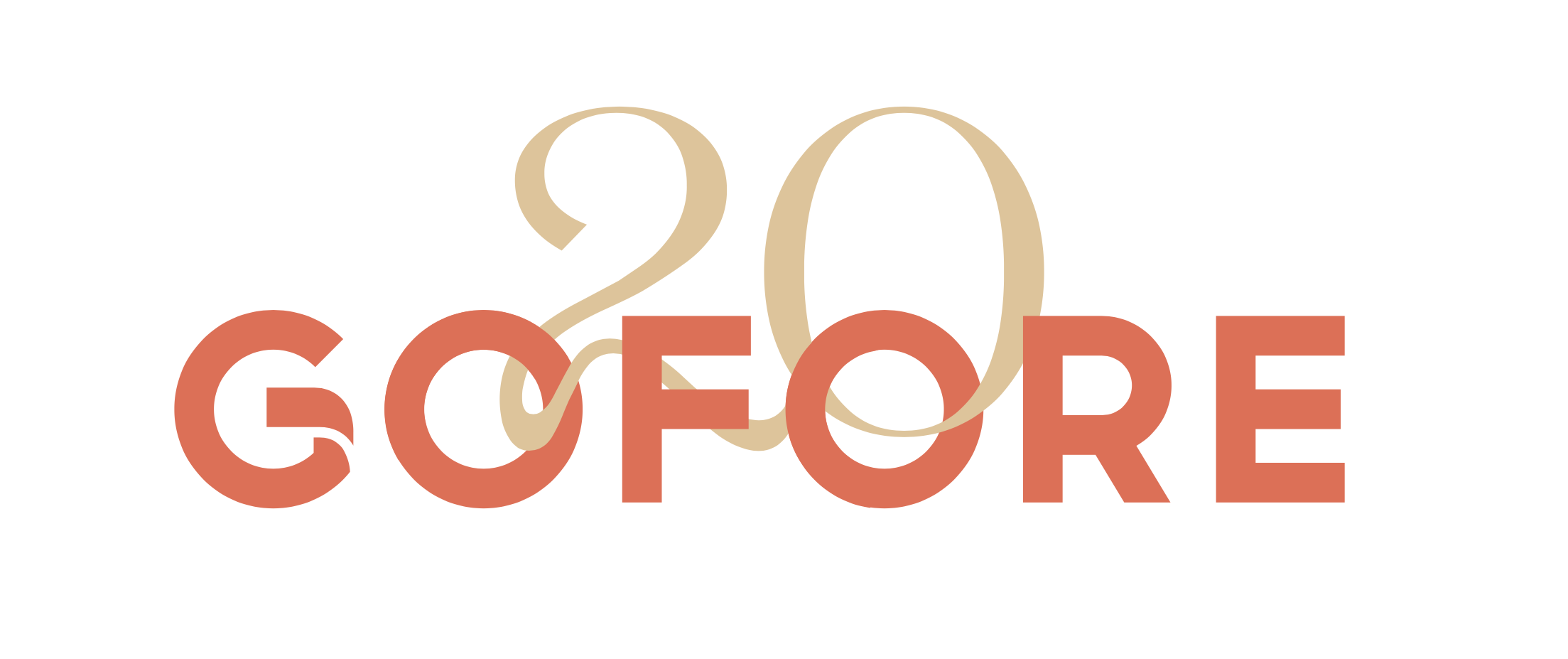
One example where I was consciously breaking the rules of the logo usage was an anniversary logo for Gofore. In one of the drafts I broke the rule of clear space by tangling the anniversary number 20 with the original logo and also the brand color palette by bringing a celebratory golden color for the ribbon. I think it worked beautifully and thus made breaking the rules justified. What do you think?
One draft I made for Gofore’s 20th year anniversary logo.
When to break the rules
A few moments justify creative deviation:
When the change supports a powerful cultural message, like Pride Month or a cause-driven campaign
When the distortion or variation adds meaning, not just style
When the brand is clearly recognizable even in its altered form
When the change is temporary and tied to a specific context or campaign
Avoid breaking the rules when you’re doing it just to stand out. Without purpose, it comes off as inconsistent. And inconsistency erodes trust.
Guidelines vs. rigidity
Think of brand guidelines as structure, not chains. They are the grammar of the brand’s visual language. But just like spoken language, grammar can be broken for effect. The key is knowing when and why.
A logo doesn’t need to be locked in place forever. It needs to stay true to its essence. That essence comes from clarity, meaning, and cultural resonance. If a creative twist on the logo can deepen that connection, then the risk is often worth it.
The logo as a living symbol
Logos are not fossils. They are not relics to be preserved in glass cases. They are living symbols. They adapt, respond, and reflect the world around them.
The best brands understand this. They don’t break the rules carelessly. They do it with intention, clarity, and often with a bit of courage.
A sacred logo is not made less sacred by transformation. In many cases, it becomes even more powerful. Not because it stayed the same, but because it showed it could move with meaning.
And sometimes, the most iconic thing a brand can do is break its own rules on purpose, and with heart.


