
Why brands like Notion embrace illustrations
Some weeks ago, I sat in on a design talk by Rob Giampietro, the Head of Creative at Notion. If you’re in design circles, his name probably rings a few bells. Before joining Notion, Rob helped steer the visual identity of Google Design, worked at the MoMA, and had a seat at the ever-influential table of Pentagram. The man knows design like a conductor knows silence, not just when to use it, but when to let it speak.
That evening, among the past cases like MoMa’s new visual identity, he spoke about the role of illustration in Notion’s brand. Not just the style choices, but the underlying philosophy: why they chose illustration at all, and how it helps Notion feel less like a tool and more like a place you’d want to stay a while. As he described it, illustration isn’t there to decorate. It’s there to signal and to express intent before a single feature is clicked.
But here’s the paradox he didn’t shy away from: Notion’s app, the actual product interface, has no illustrations at all.
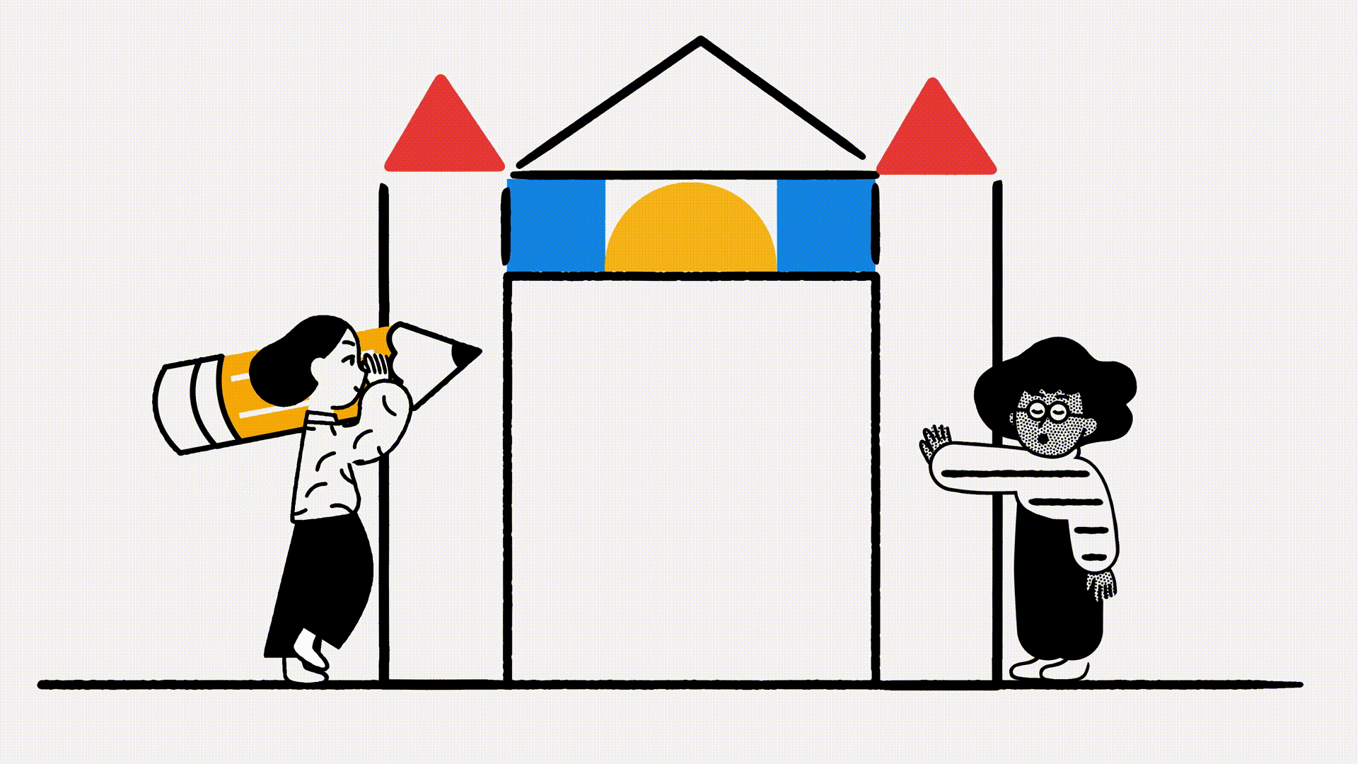
Photo by Buck
Illustration as interface between brand and mindset
At first, that seems contradictory. Why invest in a rich, considered illustration language and then omit it entirely from your core UI?
But the answer, as Rob explained, lies in restraint and clarity. Notion is a tool for thinking. The app is meant to be a calm, neutral surface. A kind of intellectual white space. To flood it with illustration would be to color the user’s thoughts before they’ve even begun to write.
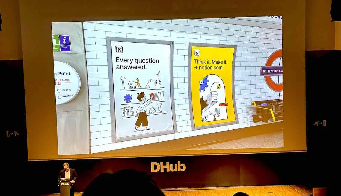
Instead, illustration lives at the edge of the experience. They use colors on the website, in onboarding, and in marketing where it's meant to frame the way you enter the product, not shape what happens inside it.
And the effect is powerful. As the It’s Nice That feature on Notion and Buck’s collaboration explains, the illustrations aren’t just there to be delightful, although they are acutally delightful. They are a deliberate counterbalance to the "over-designed" aesthetic of much of Silicon Valley. In place of glossy gradients or hyperreal 3D renders, Notion uses simple black-and-white linework, soft anthropomorphic figures, and gentle motion to create emotional space.
As the article puts it, the illustrations are “aspirational without being intense.” That may sound subtle, but in a digital landscape where everyone is shouting, subtlety can be a scream.
Brand illustration as emotional architecture
Most people think of brand illustration as surface and maybe even just eye candy. But for Notion, it's a kind of architectural framing. It shapes your expectations. It says: this is not just a note-taking app. This is a creative tool, built for people who value thoughtfulness and structure.
Take their characters for example: featureless, rounded, with minimal facial features. They’re not meant to represent anyone specifically. Instead, they create room for projection. A mirror, not a portrait. It’s one of the oldest tricks in storytelling, and Notion uses it to uncanny effect. I also try to use this in my character illustration. I want the characters to have, well, character but at the same time be abstract enough that they leave room for interpretation. Even to the point that I try to apply a certain level of genderlessness. We see ourselves in the little figures not because they resemble us, but because they make space for us.
This isn’t just design, it’s strategy. It’s tone.
Why brands keep turning to illustration
Notion isn’t alone in using illustration to establish its voice. But what makes their use feel particularly artful is the restraint. Many brands throw illustration everywhere from their dashboards, help centers, to product pages until the medium loses its meaning.
Notion applies it with precision.
This is something Buck, the creative studio behind the newest iterations of Notion’s illustration system, clearly understood. Their collaboration yielded a set of visuals that feel not only consistent with Notion’s core values (flexibility, intelligence, playfulness), but also scalable across formats from posters to social media to motion graphics.
As Buck’s design director Jesse Velez put it, they were trying to balance “expression and structure.” In other words: exactly what Notion wants to offer its users.
The avatar tool: Putting the people in the picture
Perhaps the most tangible expression of this philosophy is Notion’s avatar builder, a playful, customizable tool that lets users create their own illustrated persona. Think: tiny round-headed characters in Notion’s signature style with minimal facial features but still gentle and expressive. But now personally yours.
At first glance, it might seem like a gimmick. But in practice, it’s a brilliant bit of brand psychology. In a workspace app where collaboration is key, avatars act as visual stand-ins, softening the sometimes sterile nature of digital teamwork. Your colleague isn’t just an email or a cursor but instead they’re a little figure with glasses, or curly hair, or a hoodie. It’s a surprisingly effective way to add warmth to work.
And importantly, it reflects Notion’s broader ethos of how structure meets personality. The avatar tool takes the same modularity and freedom Notion is known for (databases, custom templates, infinite nesting) and applies it to identity. You build yourself, piece by piece, within a visual system designed to stay cohesive.
The fact that this system was created in collaboration with Buck and designed to integrate seamlessly into Notion’s brand language, shows just how seriously they take consistency. Even the playfulness is intentional.
Illustration as mood, not message
So much of tech design is built to convert. CTAs, funnels, metrics. But illustration? It’s less about click-throughs and more about creating mood and that intangible sense of place and personality.
Notion’s illustrated brand world suggests care, warmth, simplicity. But it never begs. There’s no “look how fun we are!” desperation here. Just a quiet confidence or a tone that seems to say, we’re thinking about how you think.
And perhaps that’s the real genius of Notion’s approach. The illustrations never try to do the work of the product. They simply make it easier to believe that the product will work for you.
The last quiet signal
In a world driven by metrics, illustrations remain one of the last elements of branding that feels... human first. Not because they can’t be A/B tested (they can), but because their success often lies in subtlety, in mood, in a feeling that’s hard to quantify but easy to recognize.
When a brand uses illustration well, as Notion does, it doesn’t just say “look at us.” It says, “we see you.”
And that, in the oversaturated digital world, might be the most powerful message of all.